
Yaystack Social Network®
Overview
In the summer of 2024, I interned with Yaystack as a UX/ UI Design Intern. Based out of Georgia, Yaystack is a startup that allows users to geocache giftcards and rewards in their area. As a designer, I was responsible for:
Implementing accessibility measures into visual design.
Redesigning core screens of the mobile product, allowing for stronger visual hierarchy.
Collaborating with 3 interdisciplinary team members from engineering and management to work cross-functionally through the design-thinking process.
Role
UX / UI Designer
Duration
May 2024 - August 2024
Information Architecture and Task Flow Restructure
With the app being relatively new, I outlined all of the existing tasks and flows that are contained within each screen. Then, I identified conflicting user paths and ideated on how each page could be optimized to better group related tasks.
In the first row, I created a section for each page and then branched out all of the task navigations within that page.
Next, I identified issues with the current structure. This row would include identifying what the core feature of each page should be, and then defining the subsidiary tasks that also could be housed on that page.
Finally, I took a pen tool and sketched a potential way to restructure, combine, or remove the existing tasks to contain a more even and defined information structure.

Pre-Existing Accessibility Issues
Web Content Accessibility Guidelines (WCAG) suggests a strong level of visual contrast in order for content to be highly visible in case of users with poor or limited vision. Moreover, according to Jakob’s law, users develop expectations on how an app should function based on their understanding and use of other apps.
The profile picture as well as the hamburger icons circled in red are not in compliance with WCAG guidelines, as it is difficult to see both against the map due to a lack of color contrast in dark mode.

By having the user click on the filter icon in order to recenter their map with “Go To My Position”, this violates Jakob’s Law as the user would expect the recenter button to be on the map screen.

Redesigns
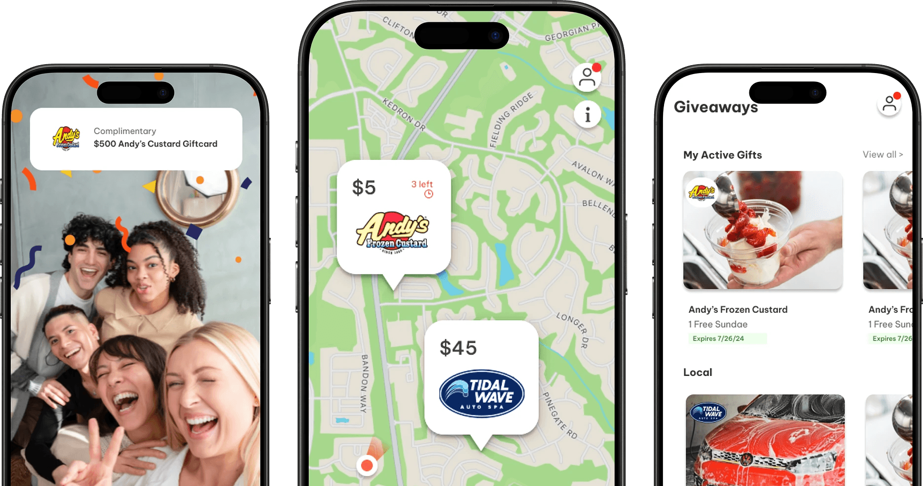
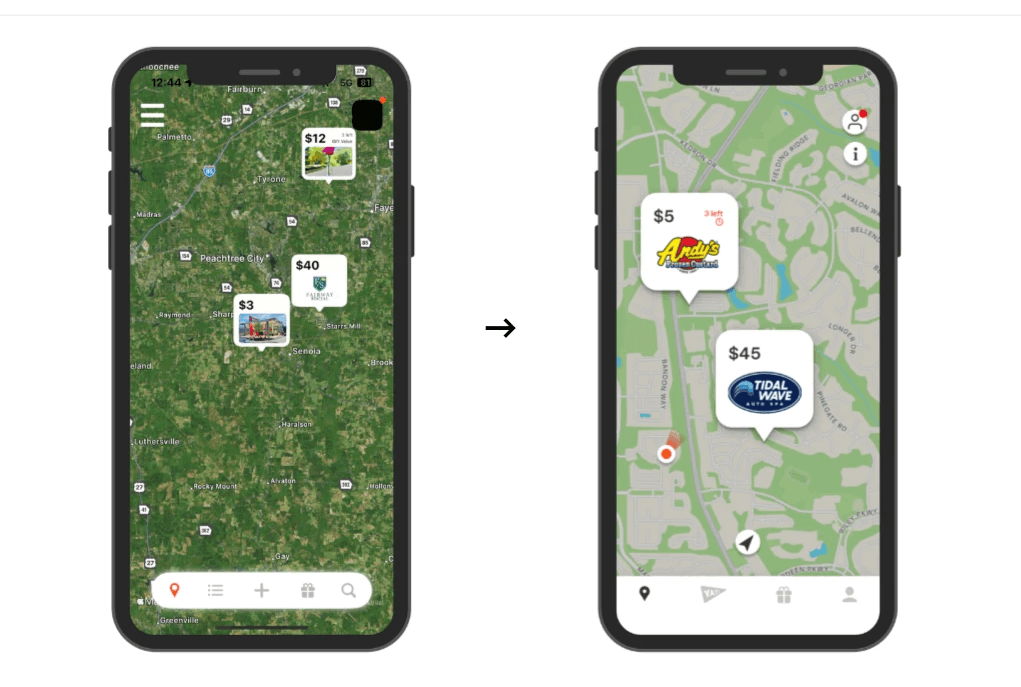
For the home map page, I removed the hamburger icon and embedded the functions onto the page via buttons (info button and recenter button). In addition, I added an orange pin to show the user where they are currently located in relation to the nearby gift cards.
I redesigned each card pop-up to be more brand-centric by containing the logo as the image as this app is intended for businesses to advertise their brand. I also changed the map style to a simple shape type to draw more emphasis to the pop ups. Lastly, I added an indicator of how many gift cards are left upon first view to emphasize urgency for retrieving the gift card.
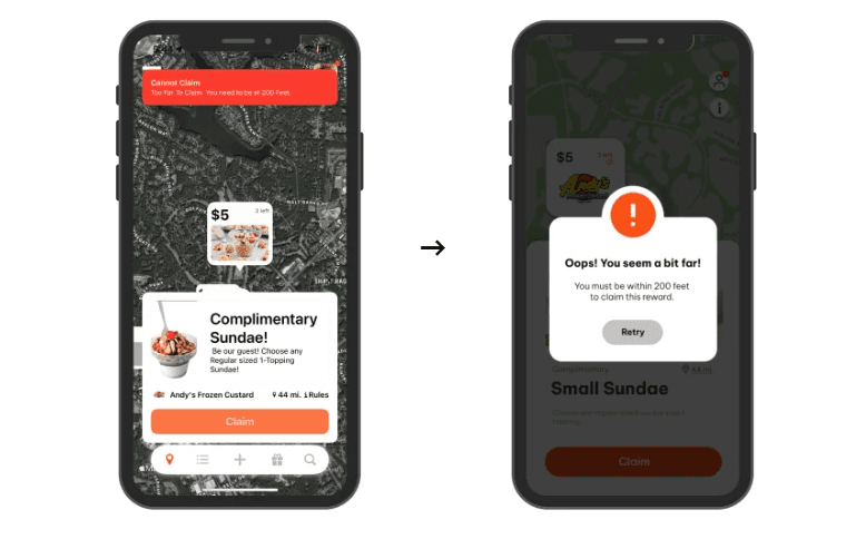
Next, upon clicking on the pop-up card, I changed the information card to a card that can be swiped down and utilizes more white space, drawing stronger attention to the call to action button. By having the “claim” button be the only active button on the bottom half of the screen, its functionality is emphasized.

Lastly, when the user is not within the radius to claim the reward, I changed the error notification to contain a kinder message as well as more clearly instructing the user of how they can correct their error.
New Features
In addition to the redesigns of current screens, I was tasked with creating several new features.
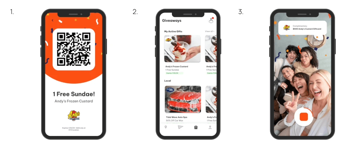
First, I created a close up QR code view of your personal coupon that can be easily accessed when using in store.
Next, I built out a giveaway home screen to show all of the users active gifts, local gifts near them, as well as expired gifts.
Last, Yaystack is rolling out a new feature where users are prompted to record video reactions to their giveaway wins, so I created a frame to capture what the video should look like to the user.
Final Takeaways
Looking back on my summer as an intern, I am proud of everything that I accomplished. Knowing what I know now, If I could go back, I would have incorporated more user research and user testing methods in my design, as it would have given me a more solid ground of reasoning for design choices.
Something especially important that I learned during my time as an intern was just how quickly adaptable you must be in a startup environment. I found a lot of excitement in getting to play a role in the brainstorming process for new features, and it was super rewarding to be able to brainstorm my own ideas for the product and get to be the one to implement them.